Barambah Organics
How dairy is meant to be.
Barambah Organics produce fresh dairy products, but their packaging design was close to its expiration date.
For multi-award-winning Australian diary producers Barambah Organics, there was no denying that their milk, yoghurts and cheeses were the tastiest out there. However, their overall appeal was let down by uninspiring packaging that faded into the background on crowded supermarket shelves.
Our mission was to align Barambah Organics' look with their philosophy for making the best-tasting dairy in the most sustainable way possible. We began with a strategic approach for their core brands, Barambah Organics and East Coast Sustainable Diary.
Our insight gathering told us that consumers want to support Australian brands. They want to know where and how their food is sourced and care deeply about healthy eating. They value good proper food that is tasty, healthy and natural, with no messing around.
These insights informed our new brand positioning and overarching brand line: Barambah Organics, How dairy is meant to be.
We developed four brand pillars to help communicate our brand story: organic, award-winning taste, locally authentic and sustainable approach.
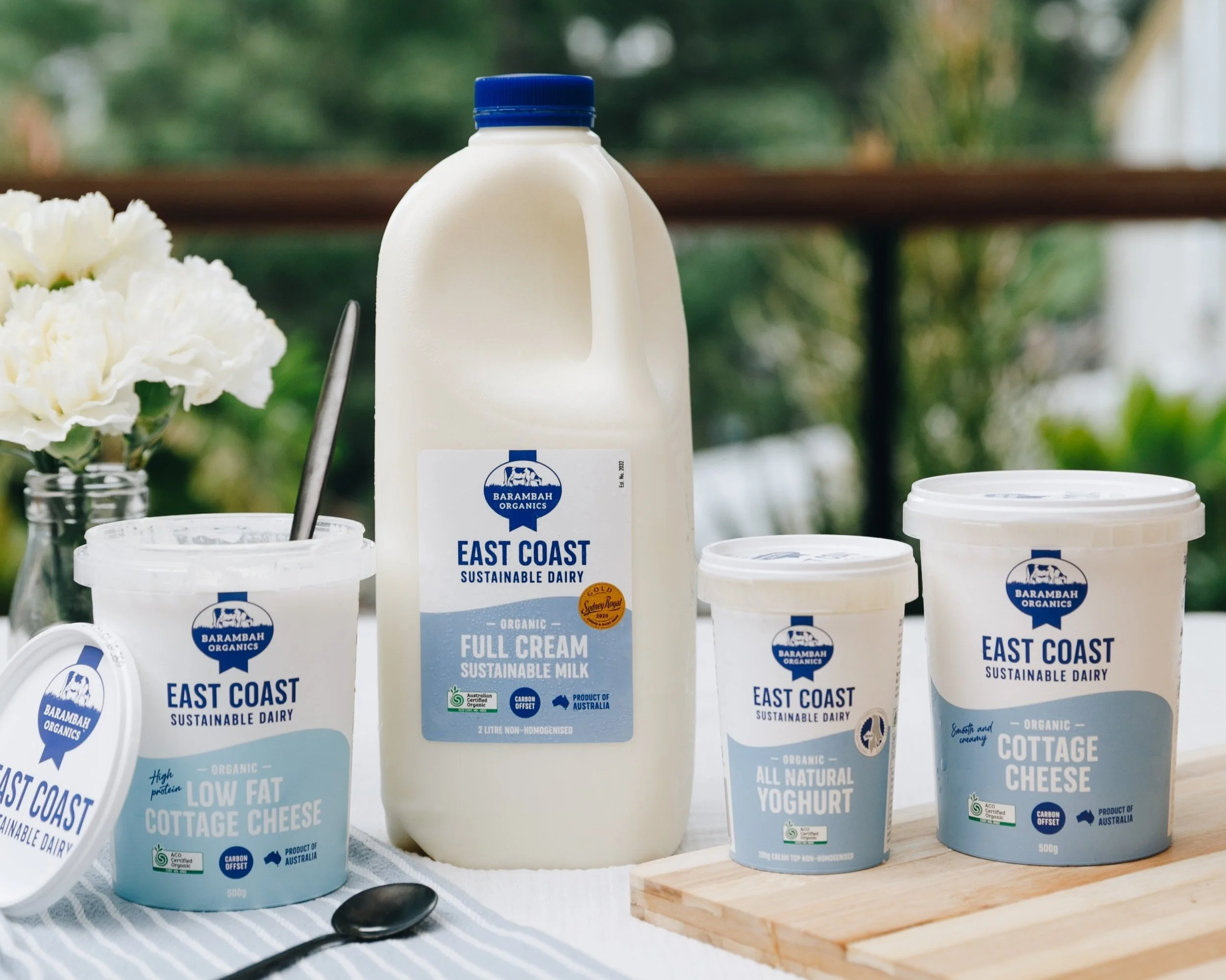
We refreshed Barambah Organic’s visual identity and rolled out a suite of new packaging designs for Barambah Organics and its niche brand East Coast Sustainable Diary.
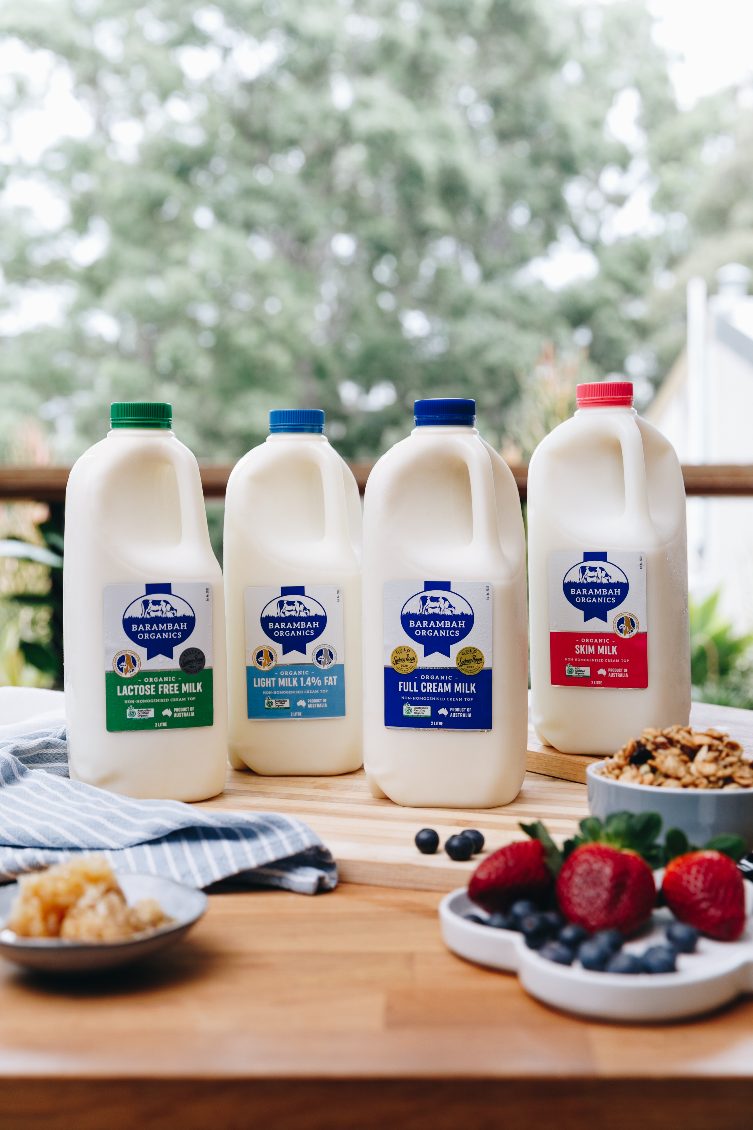
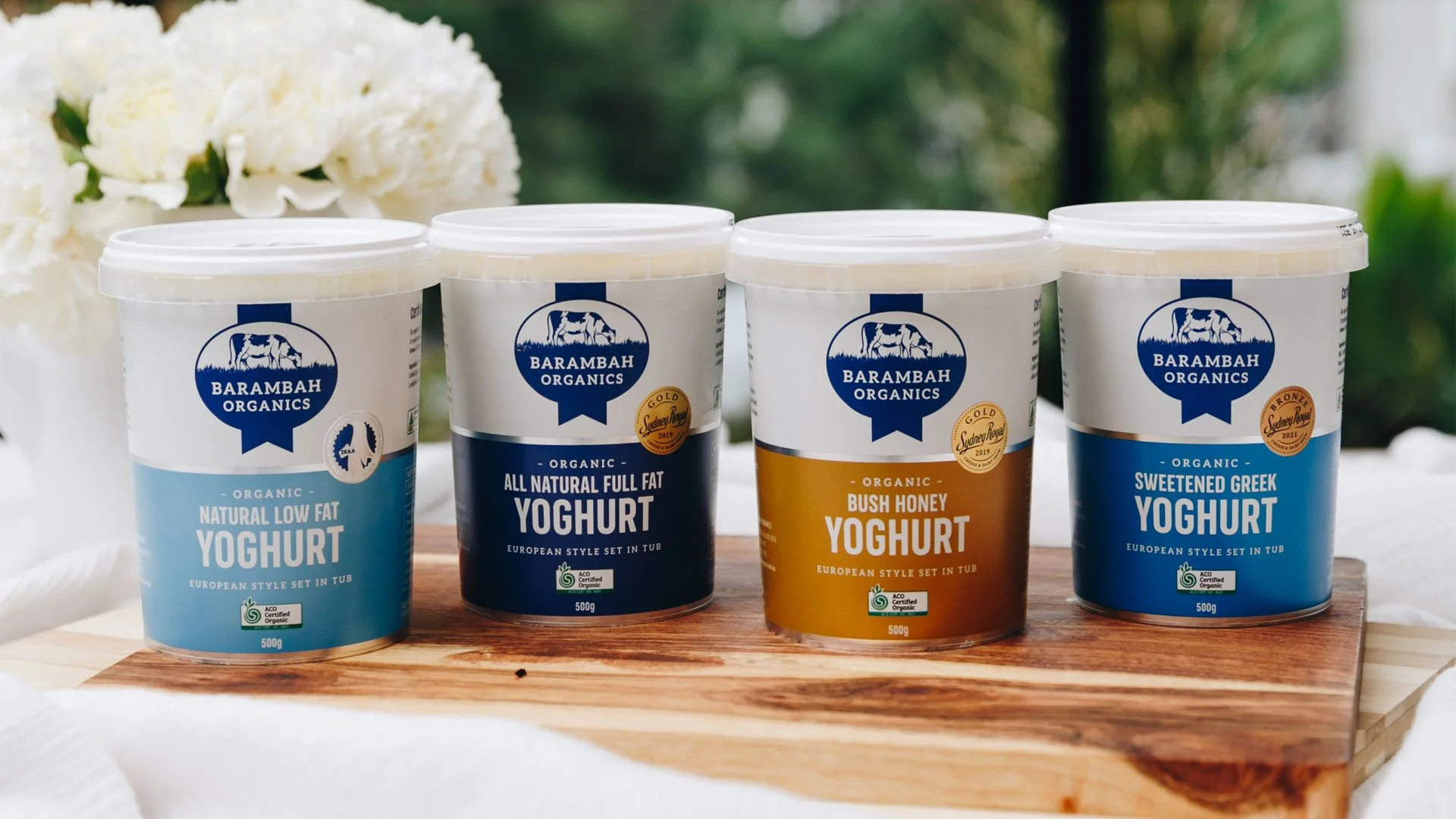
We retained elements of the conventional dairy aesthetic through typography and the bold use of blue, crafted and refined their original logo and implemented a more vibrant colour pallet to distinguish between product variants. We then positioned East Coast Sustainable Dairy as a sub-brand of Barambah Organic to leverage the existing brand presence while instilling a sense of credibility and strong brand sentiment. As this product range is made in Bellinger, we found the opportunity to connect this brand to its coastal roots by introducing a graphic wave and light colour palette to further reflect a coastal aesthetic. Overall, refreshing the range required over 65 product labels to be redesigned.
The result was a fresh and vibrant range of packs that had the flexibility to allow for new products and flavours to be introduced into the fold and a new look that would certainly grab our consumer’s attention in-store.
The new range of packaging for both Barambah Organic and East Coast Sustainable Dairy was launched in supermarkets in early June. Their new brand positioning and story are now featured across multiple channels, including their website, print collateral, point-of-sale, and marketing material shared with their retail partners.
By engaging with staff, consumers and key stakeholders throughout this entire process, we were able to create a truly authentic brand that not only would appeal to our consumers but form a brand that people from Barambah Organics would be proud of.